
Maps for a history book, ‘1014, Brian Boru and the Battle of Clontarf’.
Client: The O’Brien Press
Map Type: Historical
We were commissioned to design a series of four maps for 1014: Brian Boru and the Battle of Clontarf by Morgan Llywelyn. The maps accompany her account of one of the most significant events in Irish history, providing readers with clear geographical context while complementing the book's historical narrative.
Our approach was to create maps that were both informative and evocative of the period. Originally hand drawn in a single, muted tone, they were designed specifically for black-and-white reproduction, using tonal variation and linework to achieve clarity without sacrificing character.
Each map was distilled to its essential elements, presenting only the information necessary to support the text. Typography, decorative borders, and a custom compass rose were carefully integrated to establish a distinctive visual identity, drawing inspiration from historical cartography while maintaining a clean, contemporary editorial style. The maps enhance the reader's understanding of the campaign and contribute to the overall visual language of the publication.
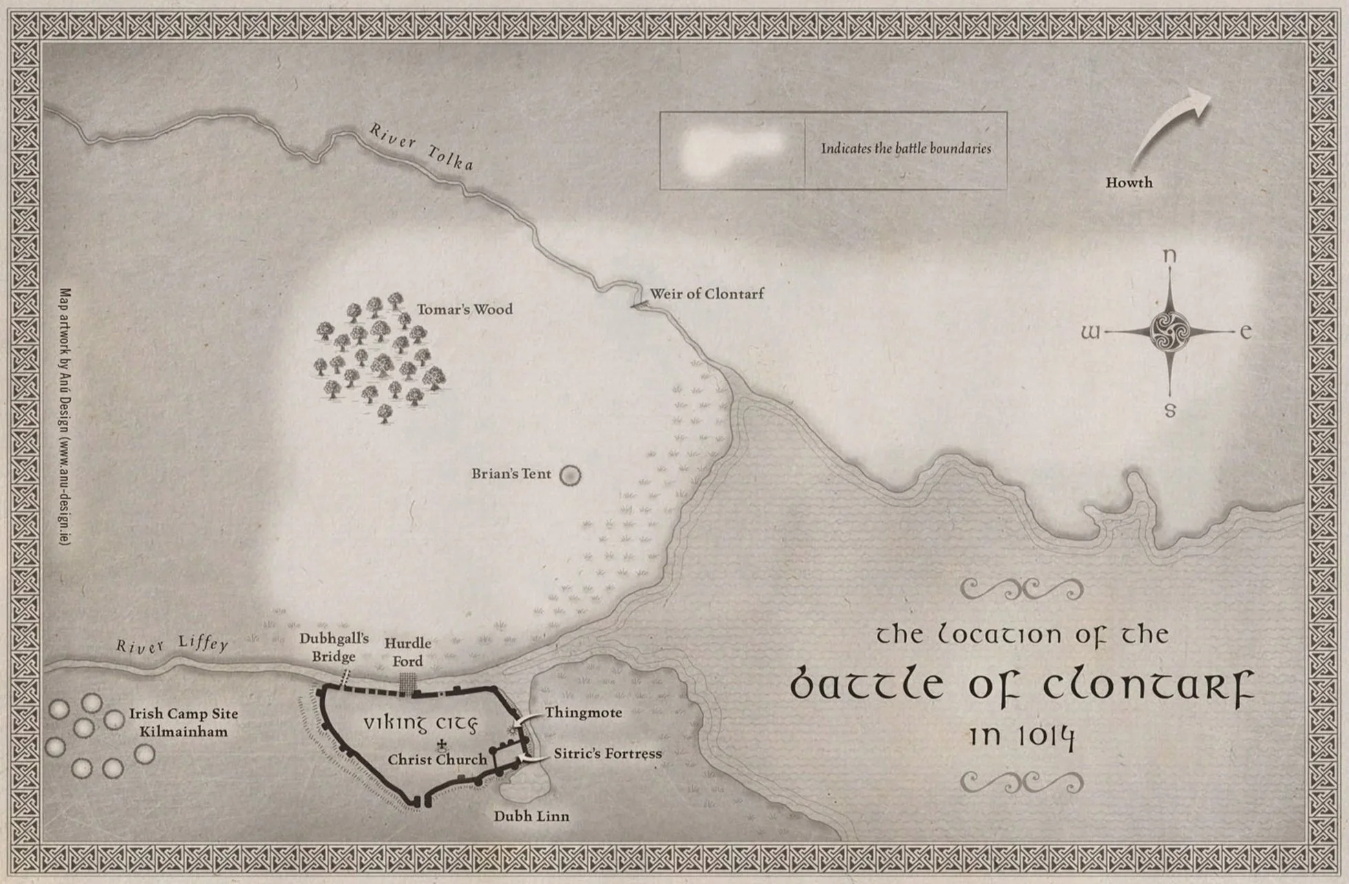
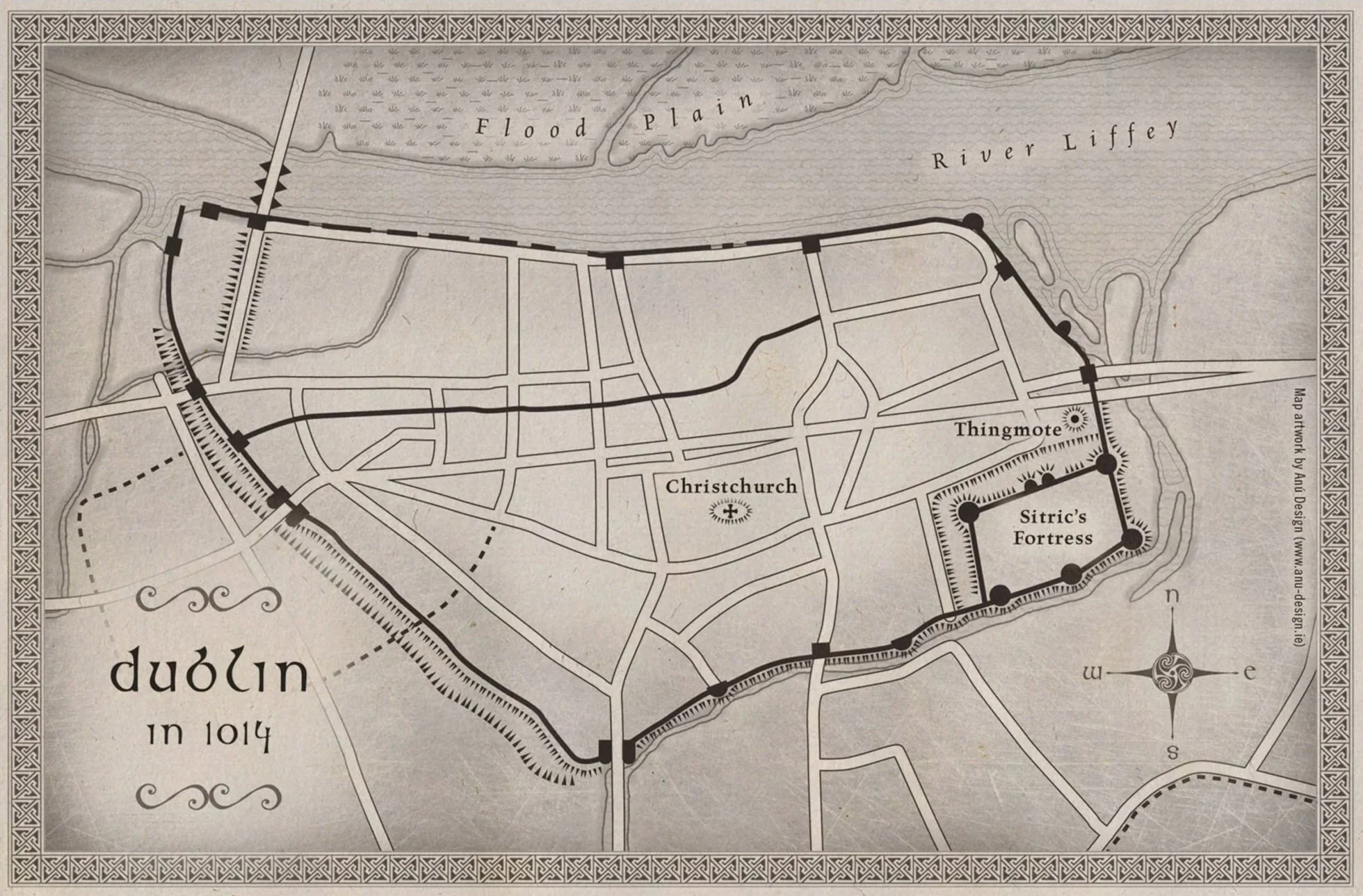
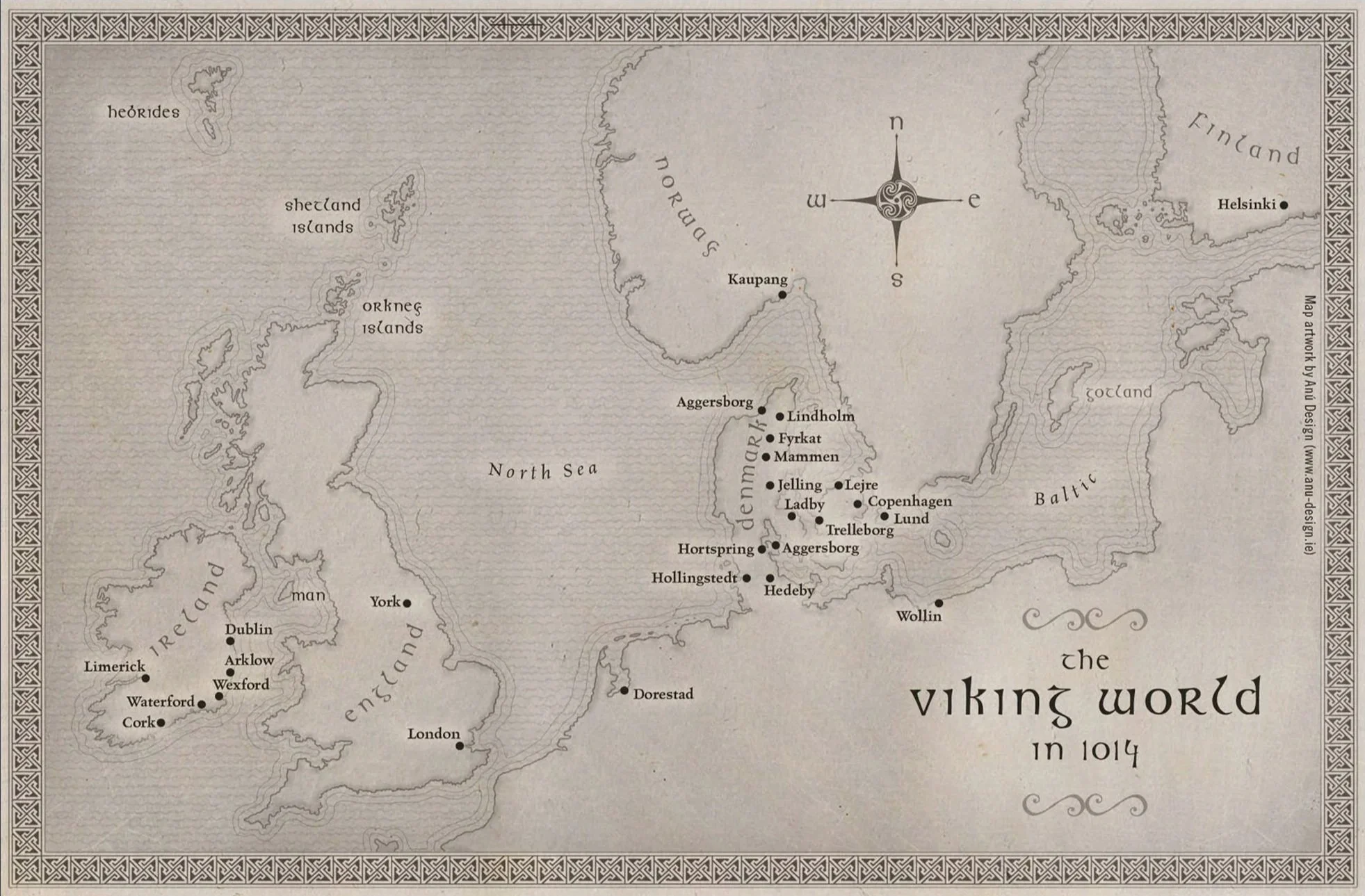
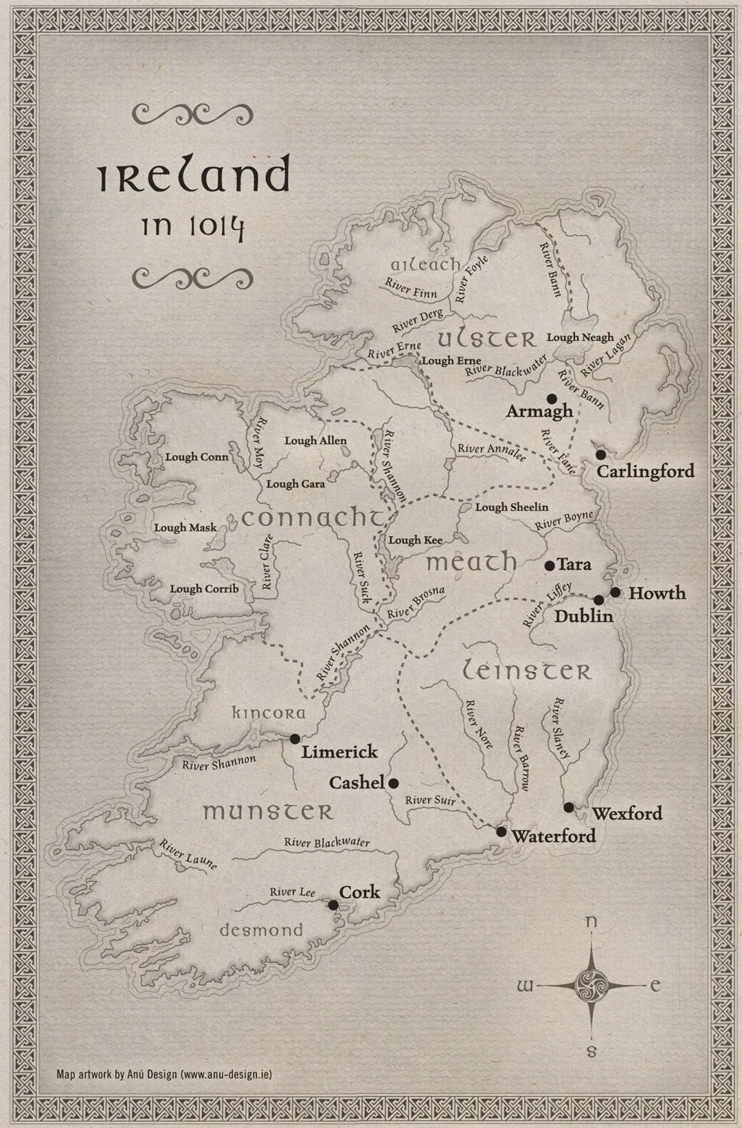
“The maps were designed to be attractive, useful for their purpose and evocative of the period. They were originally hand drawn in a soft mono colour. This colouring was appropriate – the mono colour lending itself to the black and white reproduction of the maps in the book.”